Generate More Leads With Your Landing Page
Who wants more leads?
According to recent marketing statistics from HubSpot, 63% of marketers say generating traffic and leads is their number one challenge. [1]
After all, the internet is overflowing with so many deliciously tempting possibilities for every reader. Digital appetizers appear everywhere - from free email courses to live workshops. How do you persuade your best prospects to try yours?
You can build a list full of warm leads organically by adding opt-in forms to posts or sidebar widgets. You can improve your SEO to improve your Google Page Rankings. However, if you want to scale faster or launch a new product, service, or course, you may need a landing page.
Keep reading, and I’ll show you ...
● Exactly what a landing page is
● How to design your landing page for high conversion
● And how to optimize your sales copy for response
What is a landing page?
A landing page is often at the beginning of a basic opt-in funnel. Your prospect “lands” on this page when he clicks an ad or shared link for an irresistible free offer. He surrenders his personal contact information in the opt-inform in exchange for something he wants. This could be a helpful cheat sheet, video course, ebook, appointment … whatever lead magnet/freebie/click-bait you offer.
Now you’re on your way to starting a conversation.
There are two kinds of landing pages:
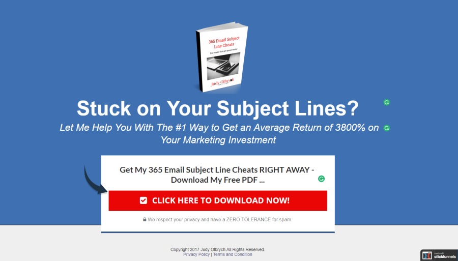
1 - A transitional landing page entices the reader to click through to the next page, where he finds a form to fill or something to buy. There’s no information TAKEN from the reader yet, you’re just warming him up for the next step. Here’s one created in minutes with a few simple tweaks to a basic ClickFunnels template:
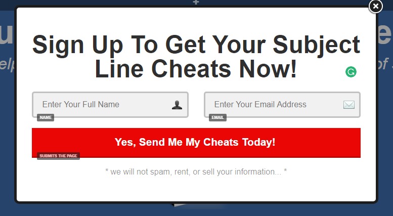
Clicking the button (branded with the red color from my website) triggers a pop-up to collect a name and email:
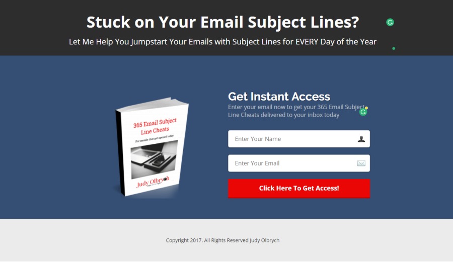
2 - A lead-capturing landing page contains a form with one or more fields for collecting contact information. The message promises something of value in exchange for a name, email, annual income, business name, # of employees, and/or favorite ice cream flavor.
Here’s a lead capturing lander for the same opt-in. This does everything on one page and skips the extra pop-up step. I made this one with quick tweaks to another ClickFunnels template. Please note that I am not a designer - I stick to the writing and built a quick example:
Design Your Landing Page for High Conversion
Be consistent
Create an experience that’s more deja vu than double-take for visitors moving from Facebook or Google ad to landing page. Use the same branded colors and fonts on the web page as you do in the ad, on your sales page, and in your site. Repeat the key words and ideas of your core message.
Trust can quickly be damaged if your readers experience an internal disconnect ... because things just seem wrong or don’t add up. This is true even on a subtle level. And that can hurt sales.
Limit options
Give your reader only one positive, clickable option.
Don’t show your navigation menu or sidebar widgets. Eliminate internal and external links. Limit your reader’s choices to one or two buttons. If you include two buttons, consider presenting and unattractive negative alternative like this:
HubSpot tested 5 landing pages with external links against duplicates in which they removed all links to top and bottom menu navigation and social share links.
The non-linked pages which were targeted to new leads gained up to 4% more responses compared to linked pages. Middle-of-the-funnel landing pages had 16% and 28% click-rate increases, respectively. [2]
Limiting options may be the fastest and easiest way to optimize your landing page, yet the vast majority of landing pages retain navigation bars.
Good UX
Clutter kills readability. Surround your primary message with whitespace. The headline and call-to-action are the most important copy (and sometimes the ONLY parts). Make sure the ONE action and message in both is clear, instantly readable, and compelling.
Use a large, readable font. Martin Pielot, a specialist in Computer-Human Interaction, recently published research with Luz Rello and Mari-Carmen Marcos showing that objective readability improves with large online body copy fonts (18, 22,16 pts). Eye-trackers measured each participant’s progress as they read selected online texts from Wikipedia. Passages where reading slowed were identified as being more difficult to comprehend. Subjective readability, determined by participants ratings on a 5-point scale, was highest for 18 pt font. Choose a font for your body copy that’s readable - not overly ornate. [3], [4]
Use color to make your words pop - Black on white is highly readable. If you use other brand colors in your text, choose a crisp font style and maintain a strong contrast against the background color. You visitors will make the decision to stay or leave in mere seconds. If they are struggling to read yellow text against a light gray background, those precious few moments will be wasted.
Choose a contrasting color for your call to action button (CTA)
Not sure what color to use? Red, orange, and green buttons have all performed well in tests. However, if you place a bright orange button on a page splattered with orange text and graphics, your CTA will be camouflaged!
Instead, try this:
- Choose a color that contrasts with the rest of the page
- Consider color psychology (people associate blue with trust, green with growth, red with passion, and yellow with happiness and/or caution)
- Choose a color and shade that complements your brand palette
- Test
Place the opt-in form above the fold - most of the time
Help your readers respond quickly and easily by placing your form above the fold for most simple pages. However, sometimes you’ll require more copy to make a convincing argument or present a higher value offer. In those cases, keep your text scannable and magnetic (more on this further down in “Extended Copy”).
Use an attention-grabbing graphic or video screenshot
Include a professionally designed graphic image of your lead magnet or video cover. Unless you’re well versed in graphics, consider hiring a designer to do this. If you’re seriously bootstrapping and design’s not your thing, your best option may be to use a template from Canva or Picmonkey
Optimize Your Sales Copy For Response
The headline
The headline is the most important part of any copy. If it fails to captivate, your reader will abandon your page. It also provides another way to convert those who won’t watch a video.
If you want a high-conversion headline:
● Use a strong action verb (Discover, Melt Away, Blast)
● Identify your audience with a simple call out (“bloggers,”), a need, a desire, or a big pain point
● Create a sense of urgency (Now, For a Limited time, don’t wait, for the first 500 people)
● Include a Big Benefit (“Create Your Own Lead Generating Landing Page in Minutes”)
Want help getting started with your headlines? Grab my 21 Headline cheats for high conversion Copy in Minutes.
Bullet points
Your bullet points must explain your offer, intensify desire for your download, and show how your reader will benefit from that you’re offering.
Your call to action (CTA)
Your Call to Action button should be the only clickable option on your landing page. Everything in the entire page is designed to help the right reader find and use it. Here are some quick tips to make it effective:
● Use the first person. Unbounce switched one CTA from “Start your free 30-day trial” to “Start my free 30-day trial” and increased CTR (click-through-rate) by 90% over a 3-week period
● Include an active verb like “Show, Tell, Send, Help, or Get” - test the verb you used in your headline
● Include a big benefit: “Lower my taxes” or “Show me how to get more leads today”
● Add an element of urgency with words like Today, Now, Today, Instant, or Rush
● If you give two choices, make it a positive and negative pair of choices.
“Send My Sales Page Templates Now” or “No thanks, I don’t want more leads”

(OK, choices like the one I just quoted are not necessarily logical. Some are uncomfortably manipulative. The positive/negative double-CTA is not for everyone or every occasion. However, there may a creative choice that works well for your offer).
Extended copy
Some landing pages require more copy to explain a more complex offer. When you need to include more words, begin with a short benefit-oriented introduction. Follow with a series of bullet points, chapter/module/feature descriptions, and/or testimonials. Because your offer is free, you don’t need the thousands of words demanded by a sales page. It’s more important for your copy to be concise, easy to read, and surrounded by plenty of white space.
When you need more copy for conversion, the CTA may be best placed at the bottom rather than the top. Neil Patel cites a study by Content Verve in which researchers tested two versions of a B2C landing page with extended copy. Moving the CTA below both the fold and the explanation of the offer resulted in a 304% conversion boost. [5]
Opt-in-form fields
Opt-in form fields vary according to the goals of each business and each campaign. For example, if you want to build a huge list with potential buyers for a course, membership site, or product you’re selling, you mostly likely need to ask only for names and emails. Make it easy to sign up.
If, on the other hand, if you want to talk to marketing managers, financial officers, or other decision makers ... or if you want to do business with companies of a particular size, use a greater number of parameters.
Consider asking for:
● Name
● Title
● Email Address
● phone number
● Name of Company
● number of employees
● Annual revenue/budget
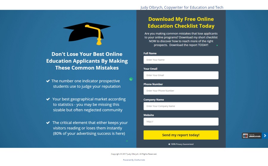
A longer form weeds out mismatched prospects and saves you time following up. In the right business and offer, eliminating fields can LOWER the response rate. A longer opt-in form suggests value or exclusivity.
Here’s one I made for online education:
Your freebie opt-in
You must create or acquire an irresistible free opt-in that entices your reader to hand over their mail address. There are so many possibilities! This is their first big introduction to your work, so make sure it looks good. Have it professionally designed.
Here are just a few examples of what you could offer:
● A recorded or live webinar workshop
● Video courses
● Email courses (this is super easy in ConvertKit)
● An eBook
● Cheat sheets
● Templates
● Calendars
● Organizers
● Tutorials
● A free 30-minute call
● Workbooks
● Gift certificates
● White papers
● Expert Interviews
Putting It All Into Place
Platforms range from free pages on WordPress sites (with landing page format selected) … all the way past HubSpot’s Enterprise plan at $2400 per month.
If you're bootstrapping, WordPress plugins like Beaver Builder and Thrive Themes are options. ClickFunnels and LeadPages are also strong choices for small businesses and solopreneurs.
Judy Olbrych, B2B Copywriter and Communications Strategist, increases ROI for international brands with high-conversion copy. Read more at www.judyolbrych.com
[1] (HubSpot, 2017) (Source: https://www.hubspot.com/marketing-statistics?_ga=2.263232137.485869060.1499792225-1255093578.1497636951)
[2] https://blog.hubspot.com/marketing/landing-page-navigation-ht
[3] http://pielot.org/tag/font-size/
[4] http://pielot.org/pubs/Rello2016-Fontsize.pdf
[5] http://neilpatel.com/blog/click-here-16-hacks-thatll-get-your-call-to-action-buttons-clicked/
Articles from Judy Olbrych
View blog
Dear Twitter, · Thank you for generously allowing me to use your informative free platform. I’m grat ...

“So What?” · (the Miles Davis song - not the Pink). · It’s forever pressed into my vinyl copy of Ki ...

Are you limiting your own recovery from Crohn’s Disease? · I’ve seen patient after patient lose hope ...
You may be interested in these jobs
-

Travel Nurse RN
Found in: ZipRecruiter Test30 US C2 - 4 weeks ago
IDR Healthcare Mooresville, United StatesIDR Healthcare is seeking a travel nurse RN ED - Emergency Department for a travel nursing job in Mooresville, North Carolina. · Job Description & RequirementsSpecialty: ED - Emergency Department · Discipline: RN · Start Date: 03/18/2024 · Duration: 13 weeks · 36 hours per week · ...
-
Caregiver Needed in Scarsdale
Found in: Talent US 2A C2 - 4 hours ago
Fairfield Family Care - Stamford CT Tuckahoe, United StatesWe need an experienced caregiver for an hourly case 10am to 4pm in Scarsdale for a very nice female senior. · Assist with basic ADL's including bathing, dressing, meal prep and medication reminders. · Start Making Money NOW Call · New applicant MUST fill out an application and ...
-
ServiceNow ITAM Design Engineer with Security Clearance
Found in: Dice One Red US C2 - 6 days ago
Tier One Technologies Bolling AFB, United StatesMUST BE US CITIZEN. SELECTED CANDIDATES MUST MEET ELGIBILTY REQUIREMENTS FOR ACCESS TO CLASSIFIED INFORMATION. Place of Performance: Onsite at Joint Base Anacostia Bolling (JBAB) Assist the government customer upgrade their platform. Once upgraded, assist to implement HAM and SAM ...


Comments
Judy Olbrych
6 years ago #2
Thanks for the shout-out, Javier \ud83d\udc1d beBee!
Judy Olbrych
6 years ago #1
Jerry Fletcher. "full bore selling system" - I like the way you put that! Yes, it works well for my clients and it's a joy to write a sales page that's well-designed on the platform (preferably by someone else!) and hooked up to a seamless sales progression. It was fun playing with it myself for this article. Do you use it in your work?